

How to Build a Mobile Rails 3.1 App
This is a simple guide to show how to use the Mobylette gem to make your Rails application respond to mobile and standard devices, and the jquery_mobile_rails gem to make it look awesome while doing that.
The final application’s source is available on Github. It is also running on heroku, if you want to check.
1. Have a running application
The application will be very simple. The specs are:
- We have a note model with title and body
- Users may CRUD note
Create a new app:
rails new mobile_sample
Add to the Gemfile:
# Gemfile

gem 'mobylette'
gem 'jquery_mobile_rails'
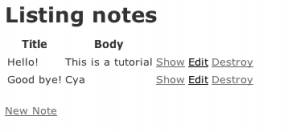
I’m using the scaffold generator, it will create everything that I need:
rails g scaffold note title:string body:text
rake db:migrate
rm public/index.html
rails s
This should be all to make the base application run.
2. Filtering mobile requests
The mobylette gem knows when a request comes from a mobile device or not.
It is very simple to use, add respond_to_mobile_requests to the application_controller.rb:
# application_controller.rb

class ApplicationController < ActionController::Base
  protect_from_forgery
  respond_to_mobile_requests :skip_xhr_requests => false
end
This allows our controllers to respond with :mobile format, when a mobile request is received. We must pass :skip_xhr_requests => false because we are using JQuery Mobile, by default the gem do not process any XHR request, even from mobile.
Create a different layout for mobile devices, application.mobile.erb:
# application.mobile.erb

<!DOCTYPE html>
<html>
<head>
  <title>Mobile Version!</title>
  <meta name="viewport" content="width=device-width, initial-scale=1">
  <%= javascript_include_tag "application" %>
  <%= javascript_include_tag "jquery.mobile.min" %>
  <%= stylesheet_link_tag    "jquery.mobile.min.css" %>
  <%= csrf_meta_tags %>
</head>
<body>
<div data-role="page">
  <%= yield %>
</div>
</body>
</html>
The data-role="page" is a JQuery mobile property. And the meta viewport`` is telling your phone to use it’s real resolution on this page.
#3. Creating the mobile views
The application can distinguish mobile from standard requests already. Now let’s create some different mobile views using JQuery Mobile’s marks.
# index.mobile.erb

<div data-role="header">
  <h1>Notes</h1>
</div>
<div data-role="content">
  <ul data-role="listview">
  <% @notes.each do |note| %>
    <li>
    <%= link_to note do %>
      <h2><%= note.title %></h2>
      <%= truncate(note.body, :length => 25) %>
    <% end %>
    </li>
  <% end %>
  </ul>
</div>
<div data-role="footer">
  <%= link_to 'New Note', new_note_path %>
</div>
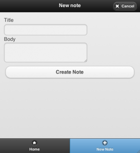
# new.mobile.erb

<div data-role="header">
  <h1>New note</h1>
</div>
<%= render 'form' %>
<div data-role="footer">
  <%= link_to 'Back', notes_path %>
</div>
# edit.mobile.erb

<div data-role="header">
  <h1>Editing note</h1>
</div>
<%= render 'form' %>
<div data-role="footer">
  <%= link_to 'Show', @note %>
  <%= link_to 'Back', notes_path %>
</div>
# _form.mobile.erb

<div data-role="content">
  <%= form_for(@note) do |f| %>
    <% if @note.errors.any? %>
      <div id="error_explanation">
        <h2><%= pluralize(@note.errors.count, "error") %> prohibited this note from being saved:</h2>
        <ul>
        <% @note.errors.full_messages.each do |msg| %>
          <li><%= msg %></li>
        <% end %>
        </ul>
      </div>
    <% end %>
    <div class="field">
      <%= f.label :title %><br />
      <%= f.text_field :title %>
    </div>
    <div class="field">
      <%= f.label :body %><br />
      <%= f.text_area :body %>
    </div>
    <div class="actions">
      <%= f.submit %>
    </div>
  <% end %>
</div>
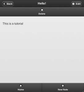
# show.mobile.erb

<div data-role="header">
  <h1><%= @note.title %></h1>
</div>
<div data-role="content">
  <p id="notice"><%= notice %></p>
  <p>
    <%= @note.body %>
  </p>
</div>
<div data-role="footer">
  <%= link_to 'Edit', edit_note_path(@note) %>
  <%= link_to 'Destroy', @note, confirm: 'Are you sure?', method: :delete %>
  <%= link_to 'Back', notes_path %>
</div>
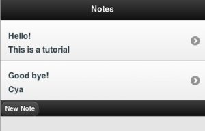
The views are almost the same, I know. The application, from a mobile device, should be looking like this:
4. Getting Better
You should read the JQuery Mobile Docs to learn how to improve the look of your application. I’ll write a guide about how to turn this application into a real mobile app later, and because of that, I made some changes in the layout to make it look cooler. It’s the first time I’m playing with JQuery mobile, so dont expect too much =p. These changes are in the github repo.
You can check the final app running online here.

5. Links
- http://jquerymobile.com/demos
- http://fuelyourcoding.com/getting-started-with-jquery-mobile-rails-3/
- http://tscolari.github.com/mobylette/
UPDATE: